37° 48' 15.7068'' N, 122° 16' 15.9996'' W
MODERN MAP MAKING HAS ARRIVED
37° 48' 15.7068'' N, 122° 16' 15.9996'' W
MODERN MAP MAKING HAS ARRIVED
37° 48' 15.7068'' N, 122° 16' 15.9996'' W
MODERN MAP MAKING HAS ARRIVED
37° 48' 15.7068'' N, 122° 16' 15.9996'' W
MODERN MAP MAKING HAS ARRIVED
37° 48' 15.7068'' N, 122° 16' 15.9996'' W
MODERN MAP MAKING HAS ARRIVED
37° 48' 15.7068'' N, 122° 16' 15.9996'' W
MODERN MAP MAKING HAS ARRIVED
37° 48' 15.7068'' N, 122° 16' 15.9996'' W
MODERN MAP MAKING HAS ARRIVED
37° 48' 15.7068'' N, 122° 16' 15.9996'' W
MODERN MAP MAKING HAS ARRIVED
37° 48' 15.7068'' N, 122° 16' 15.9996'' W
MODERN MAP MAKING HAS ARRIVED
37° 48' 15.7068'' N, 122° 16' 15.9996'' W
MODERN MAP MAKING HAS ARRIVED
Maps
Editorial
Making maps for the New York Times: the unexpected career of Tim Wallace
Tim Wallace is a prolific maker of maps, an advisor to Felt, and senior editor for geography at the New York Times. We interviewed Tim to understand what makes him tick.

You and your team at the Times have created many beautiful, informative and distinguished pieces. Which piece are you most proud of?

A lot of my work in the early 2010s was writing about people as a trend in the data, not connecting the data to individual stories. I’m most proud of the moments I found opportunities to break this mold and really push the boundaries of cartography and geography I’d normally be working within. The piece that springs foremost to mind was on the aftermath of Hurricane Harvey. A colleague and I went to Houston and rented the biggest car we could find to get through the flooded roads; we flew drones and took images over the course of several days. We were talking directly with people experiencing the crisis wherever we could, and seeing it for ourselves. It’s not surprising that just changed the tone and method of the reporting.

Somewhat adorably, you have the distinction of being interviewed by Cricket, the children's magazine.

Cricket Magazine carries special meaning for me. I struggled with learning disabilities growing up, including dyslexia and short term memory issues that made it hard to read. My parents were super patient and would encourage me to try different types of reading at my own pace. I gravitated toward Cricket and Highlights and other magazines like them. Then, a few years ago, an editor from Cricket called and asked to interview me about modern maps and mapping, and it truly brought a tear to my eye because Cricket was full of my childhood heroes, and now I could give back to the publication that meant so much to me.

Geology and oceanic cartography legend Marie Tharp was featured in the same issue of 'Muse'–Cricket Media's Science Magazine–which added to Tim's delight.

Mapping the news requires you to be in dynamic, high pressure situations. Things can't always go smoothly. Tell me about ‘that one time’ things went really wrong.

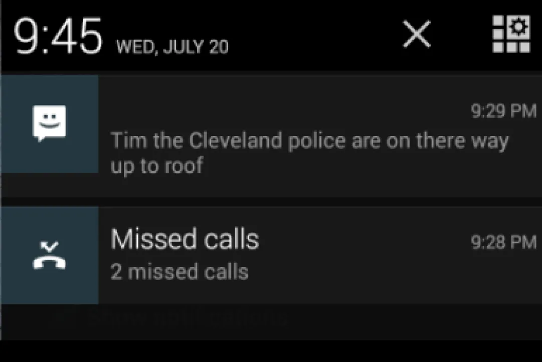
In July of 2016, my colleague Alicia Parlapiano and I were sent to Cleveland to cover the Republican National Convention. One of our lines of coverage was a survey of convention-goer garb.

Another line of our convention coverage was more serious. We wanted to cover the anatomy of a daylong protest space. So, I found a property owner who was willing to let us set up a timelapse camera on his roof overlooking the Cleveland Public Square. We also—and this is crucial—checked with authorities about off-limits areas. This rooftop was in an area of the city not cordoned off by security, so we were technically in the clear. 

But as soon as I took a look at the view we had, I was nervous that the security situation could change. I repeatedly shared my nerves with Alicia. She was admirably chill about the whole thing, insisting that I worried too much. 

Sure enough, though, when the time came to check on the camera, someone on the ground got spooked by a glimpse of us on the roof, alerted law enforcement and within minutes we were swarmed by 8 or so police officers.

Thankfully, after we dismantled the camera setup, it all ended amicably. The view up there was beautiful, and Alicia even took a group photo of the officers on one of their phones. 

"I wonder if we could get in trouble."

This is one of my favorite professional memories because it was the culmination of a day of me saying "I wonder if we could get in trouble" and Alicia pushing back "Gee you worry a lot, lol." 

We were both right.

We think of you as an encyclopedia of mapping knowledge, overflowing with creativity and talent. What got you interested in maps to begin with?

I wouldn’t at all call myself an encyclopedia, but I do love learning as much as I can about maps. 

I was that kid clinging to an accordion map in the back of my parent’s Pinto, for sure, but my path to cartography was not a direct one. It was really a slow arc, from thinking early on that I wanted to be an archeologist, to realizing I actually wanted to understand everything I could about the earth and how we look at it. Looking back, I knew that understanding the places and landscapes where things happened is crucial to archaeology. When I minored in geography and majored in archeology I told my dad, "I want to minor in geography because there is no archeology without geography." 

I studied more archeology after that–I even got my masters in maritime archeology. And, then I worked as an archeologist for several years, and some of it was fun and fulfilling and some of it was stuff like relocating human remains from cemeteries. On balance, the work interested me, but what interested me most was the geospatial element to it all. 

I had gotten pretty good at making maps using my firm’s legacy style guide, but I didn’t understand how to contribute to the guide or make it better. I would open up the New York Times weather page and admire the crystal-clear graphics and charts. I saw there was a visual language out there that I wanted to learn and I decided to go to Madison and get my PhD.

Would you say any particular technology has changed the way you work?

Actually, I think more than any one system or interface, it’s been my approach to technology that’s changed the way I work. Initially, I thought I needed to know a few tools to get my work done, but I know now that relying on a single piece of technology, or just a handful of them, will only slow me down and narrow my options. Over a decade ago, I came to news cartography thinking I could skate by using just Arc and Python. But I ended up needing to be really fast with Illustrator and comfortable with the Mac terminal, Bash scripts, Python and other Adobe products. I might use Blender for a month or FME. Any success I have comes from learning the tools that satisfy my workflow needs, and being confident hopping from tool to tool. I’m still learning what I can, too, because it’s always evolving.

There is one thing that really stands out though: GDAL (Geospatial Data Abstraction Library). I process all my data in it. I can’t imagine my job without it.

The Felt team admires the maps that come from you and your team on a daily basis. What maps dazzle Tim?

I’ll start by saying that data graphics, from simple breaking news maps to big, sweeping geographic visualizations, are the stuff of my work, and I love making them. But they don’t dazzle me. Instead, as a map-reader, the types of maps that I really crave and adore either have a beautiful artistic touch, like the maps of Jennifer Thermes, or are about the human experience, like the Smellscape maps by Kate Mclean. They’re examples of great cartography that is also beautiful!

Smellscape map, Kate Mclean.

What excites you most about Felt's potential?

My favorite maps have always been the ones made in the moment, either out of necessity or on a whim. Felt’s drawing tools are super exciting to me. Being able to draw that impromptu back-of-a-napkin type map with friends and colleagues scattered around the world is such a fun idea. 

Aside from practical applications of a collaborative mapping tool, drawing together on Felt will allow more mental and cognitive maps to be shared with the world. I love that thought in particular. It’s beautiful to see how other people interpret and define space. It’s never one-to-one. And there is magic in that.

I’m most proud of the moments I found opportunities to break the mold and really push the boundaries of cartography and geography I’d normally be working within.

A few years out of college, while working as an archaeologist, I prompted a few friends to draw Minnesota from memory (see image). The next day I layered them on a surveyed map of Minnesota and shared them back. I LOVE mental maps.

It’s beautiful to see how other people interpret and define space. It’s never one-to-one. And there is magic in that.
Bio
Tim Wallace is a senior editor for geography at The New York Times and an Advisor for Felt. He makes visual stories with information gathered from land, sky and space. He has a Ph.D. in geography from the University of Wisconsin-Madison.
LinkedIn
More articles

Cartography Tips for Designing Web Maps

Search, filter, select — data discovery done right

Getting the most out of Felt’s new Workspaces

Teaching Spatial Analysis with Felt

Powerful new admin tools and a streamlined billing experience

Three key UI upgrades in Felt 2.0