Learn how to make your own proportional symbol map
A proportional symbol map uses different size shapes to compare locational information. It’s a simple concept: The bigger the symbol, the higher the data value; the smaller the symbol, the lower the value. These maps measure numerous items, like the density of school placement and the intensity of wildfires.
Instead of relying on shaded areas or distorted boundaries like cartograms and choropleths, proportional symbol maps convey data through variations in size. This often feels more intuitive and makes patterns in the data more visible at a glance.
Let’s break down what proportional symbols are and when they work best. Plus, learn how to design your own interactive map using Felt.
What’s a proportional symbol map? Comparison with a graduated symbol map
Proportional symbol maps visualize data using scaled shapes (usually circles) at specific locations. Symbol size corresponds to data value, so higher values have larger symbols while lower values appear smaller. This creates a clear visual comparison independent of region size, as opposed to choropleth maps that separate areas by color, so land mass could distort at-a-glance perception.
Here are a few reasons why teams use proportional symbol maps:
- Allows easy pattern detection by comparing symbol sizes
- Reduces geographic bias by tying symbol size to data values (not land area)
- Overlays on basemaps or other thematic map layers for added context
What’s a graduated symbol map?
Graduated symbol maps group data into categories, using the same symbol size for all locations within a single category. You might see several spots with the same size symbol, even if their actual values are slightly different. For example, a graduated map may sort symbols into small, medium, and large, while proportional symbol maps use a flexible size that represents the exact numbers.
When choosing between these types, it really comes down to how much precision you need. Directly proportional symbols scale each circle to match the exact data value, giving you a continuous, precise representation. On the other hand, gradual symbols place data in value ranges, meaning all points within a specific range get the same symbol size.
Step-by-step guide to create a proportional symbol map on Felt
Felt makes building proportional symbol maps quick and approachable. Use these steps to transform raw numbers into an easy-to-read visual story.
1. Upload your data
Start by adding your data to Felt. With the Upload Anything feature, you can import any file that includes location information and at least one numeric field. Felt reads those values to size the symbols on your map, and it automatically plots each point so you can see exactly where your data falls.
2. Open the style editor
In Felt, the style editor lets you adjust how your symbols look and behave. It’s essentially the control panel where you shape your map’s visual style, like choosing Raster or Vector infrastructure.
3. Choose size range visualization
Within the style editor, choose a size range for your symbols. This tells Felt to scale each symbol according to its data value instead of keeping all symbols the same size.
4. Select the numeric attribute
Pick the numeric field you want the symbols to represent, such as population or sales volume. Felt uses this to calculate symbol size, so the shapes will grow and shrink when the right data changes.
5. Refine symbol appearance
To fine-tune your symbols, you can adjust circle size limits, color, and opacity to reduce overlap and improve readability. Small tweaks here and there can make a big difference, especially when data points sit close together. For example, you may choose contrasting colors for data points that often overlap so you can pick them out from a distance.
6. Customize the legend and interactivity
Lastly, set up your legend to help readers instantly recognize what your symbols mean. You might also add hover or click interactions so viewers can explore exact values without cluttering the map.
Applications of proportional symbol maps
Here are some real-world examples of proportional symbol maps in action.
Active wildfires in the US
The map below shows wildfires in the U.S, using live data from the National Interagency Fire Center and National Oceanic and Atmospheric Administration. It tracks factors like fire size, smoke, and air quality. Larger circles indicate extreme activity, while smaller circles suggest the opposite. These symbols reveal where fires are most severe and which locations need emergency response.
Transportation safety
This map provides details on traffic volumes, crash corridors, and planned bike lanes throughout Portland, Oregon. The proportional symbols (purple circles) represent average daytime traffic — with larger circles indicating more vehicles on the road. Transportation planners can use this data to prioritize infrastructure improvements and identify safety issues.
Risk index explorer
This map uses proportional black circles to visualize insurance risk across Texas and Louisiana. The bigger dots, seen in Dallas and Houston, show the number of policy holders. The map’s symbology also displays high-loss regions and natural hazard exposure. This allows providers to understand risk and price insurance policies accordingly.
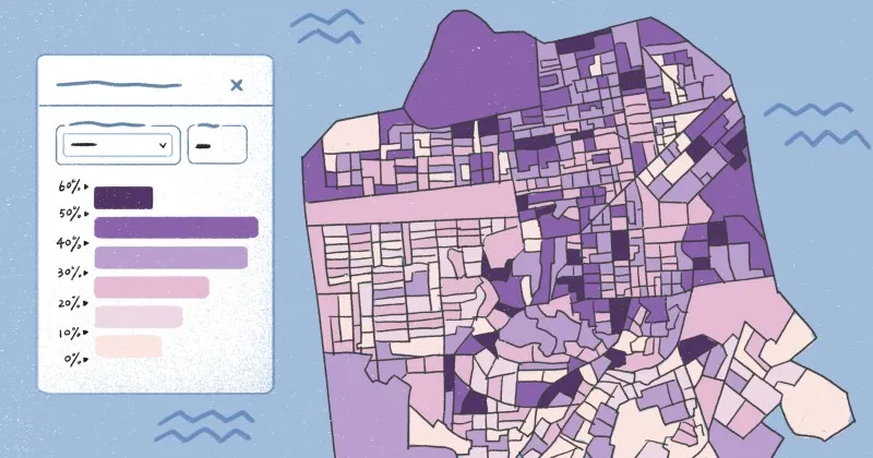
Public schools and student-age populations
The below map illustrates the number of public schools by neighborhood in Denver, Colorado. The bigger the purple circle, the more schools in that neighborhood. The map also measures the school-aged population in each area using a choropleth map layer. Color contrast makes it easier to compare the ratio of schools to students. Planners and policymakers can use this map to identify regions that need new facilities.
Build easy-to-understand maps with Felt
Proportional symbol maps encourage quick understanding and accurate comparison. This intuitive system lets teams examine data without geographic size bias. If you’re looking to build an interactive map you can instantly comprehend, give Felt a try.
Felt makes it simple to create maps that are easy to interpret and act on. With just a few clicks, you can add hexagonal grids, scale symbols by data magnitude, and analyze spatial patterns. Enhance clarity and consistency by assigning icons to certain categories and creating a library of team-specific symbols.
Book a demo, and start building intuitive, interactive maps with Felt.
Compare Felt using AI