Map symbology in GIS: A guide to effective design
The difference between a map that answers questions and one that leaves people guessing often comes down to its design, not the data behind it. Comprehensive design is thanks to map symbology, and it helps you interpret and analyze spatial data whether you’re visualizing transportation networks or environmental conditions.
Map symbolization uses color, distinct shapes, and different sizes. This makes maps intuitive and easier to grasp visually, helping both GIS professionals and non-technical stakeholders understand and navigate complex datasets. Cloud-native GIS platforms like Felt apply symbology standards at scale across connected data sources, so teams spend less time rebuilding styling for every map.
Let’s explore the definition for symbols in geography and best practices for designing maps that tell a meaningful visual story.
What’s a map symbol, and why does symbology matter
A map symbol represents a geographic feature using elements like colors, shape, and size. Symbology helps readers interpret data visually. For example, a darkening color gradient may represent rising temperature. This visual language is a core part of cartography, transforming raw spatial data into a format people can easily analyze. Map symbology supports:
- Better readability so users can identify features and navigate complex information
- Stronger visual hierarchy by using different colors and sizes to highlight key data
- Easier pattern recognition with symbols that reveal spatial trends and relationships
- Faster decision-making by turning map insights into accessible, understandable information
- Greater audience understanding thanks to consistently defined symbols
At the enterprise level, organizations establish visualization and symbology standards. Shared colors and legend map symbols allow teams to interpret information and move between projects without relearning the entire map.
Visual variables used in map symbology
The symbols you use depend on your audience and the type of map you create. Say you want to display the scaling number of students enrolling in a school. You may use a thematic map with proportional symbols to show growth at a glance.
Let’s take a look at the most common ways to visualize geographic data.
Color
A map’s color scheme shows increasing and decreasing levels of intensity. This communicates metrics instantly, so teams don’t have to read every data point or analyze features individually. Here are some methods to use color in maps:
- Sequential color schemes: Uses one fading color family to depict low-to-high values, like population counts or elevation changes.
- Diverging color schemes: Uses two contrasting colors to split data above or below a middle target, like temperature deviations.
- Qualitative color schemes: Uses completely different colors to separate categories without a rank, like land-use types or business locations.
Standardized color schemes help teams interpret metrics and conditions, and the same color might symbolize a specific status in multiple reports. For example, red always indicates a critical issue and green means normal operations.
Size
Size represents magnitude by showing differences in quantity. Large symbols can highlight higher values, while smaller symbols signal lower ones. Common use cases include population by region, revenue by location, and traffic volume road networks.
Standardized sizing rules allow enterprise teams to compare performance, demand, and operational metrics across regions and reports. When maps follow the same sizing conventions, users can compare values without relearning the scale for each visualization.
Shape
Shape gives features their own visual identity, making it easier to differentiate points of interest and facilities, like schools, hospitals, and warehouses. Map shapes include geometric shapes, like triangles and circles, and recognizable, relevant symbols. For example, a map may use an airplane icon to denote an airport.
Further, different line styles help represent linear features. A solid blue line may indicate water, a brown line might show elevation, and a dashed or dotted line could stand for trails or routes with varying classifications. Using consistent cartography symbols helps build a shared visual language, so everyone can instantly recognize infrastructure, whether they’re an engineer or a customer.
Pattern and texture
Patterns are another way to classify areas when color doesn’t show enough detail. This helps separate overlapping categories. For instance, a map might use green to denote tree cover, and then layer diagonal lines over green features to mark protected land.
Common types of geographical symbols on maps
GIS professionals represent most features using points, lines, and polygon symbology. Let’s take a closer look.
Point symbols
These symbols illustrate locations and places of interest as a single point on a map. They let users identify individual features that may be too small or detailed to display as an area. Popular point symbols include cities, stores, and utility assets like fire hydrants and streetlights. GIS teams can customize point symbols in several ways depending on the information they need to communicate:
- Simple markers pinpoint locations without visual complexity
- Scaled symbols change size based on a value, such as store revenue
- Unique symbols represent specific categories, like facilities and infrastructure
Line symbols
Lines connect locations or show paths across an area, like rivers, pipelines, and transit routes. People use them to highlight networks and natural features that have length but not a defined area. These symbols rely on several visual variables:
- Color that differentiates categories or conditions, like a blue line for water features
- Width showing capacity or importance, like wider lines for major transit routes
- Patterns using solid, dotted, or dashed lines to separate feature types
- Directional styling that applies indicators like arrows to show movement and flow
Polygon symbols
These symbols describe areas with defined boundaries. They’re useful for showing geographic spaces like regions and zones. Unlike point and line symbols, polygons allow users to analyze features based on their coverage and spatial relationships. Typical examples are parcels, administrative boundaries, and protected regions. Teams can stylize polygons with:
- Colors to highlight categories and classifications
- Transparency so overlapping features are still visible
- Patterns to separate similar features
- Outlines to mark zoning borders, city limits, and parcel edges
Choosing the right symbology for your data
Symbology depends on the data on the map and its purpose. A cartographer designing a topographic map will use different symbols than an operations team tracking infrastructure or a business team analyzing customer trends. Choosing the right colors, shapes, and styles helps users understand and focus on relevant information.
Here are a few common data types and ways to represent them with symbology.
Categorical data
This data groups features by type. GIS professionals frequently assign values, colors, and symbols to distinguish categories and help users identify features.
In the real world, you might see this as planners mapping land use types or operations teams displaying facility types. Each category receives a unique symbol or style so users can recognize patterns at a glance.
Quantitative data
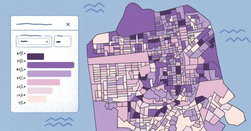
Quantitative information represents numerical values, and GIS teams typically use graduated symbols and choropleth maps to show these differences in magnitude.
Choropleth maps use color variations to show patterns. For instance, a map might use distinct colors to show shifting customer density, supporting decisions around market expansion.
Graduated symbols change size based on a value, so teams often use them to compare datasets. Larger symbols might highlight areas with stronger sales performance across territories or more incidents requiring operational attention.
Continuous data
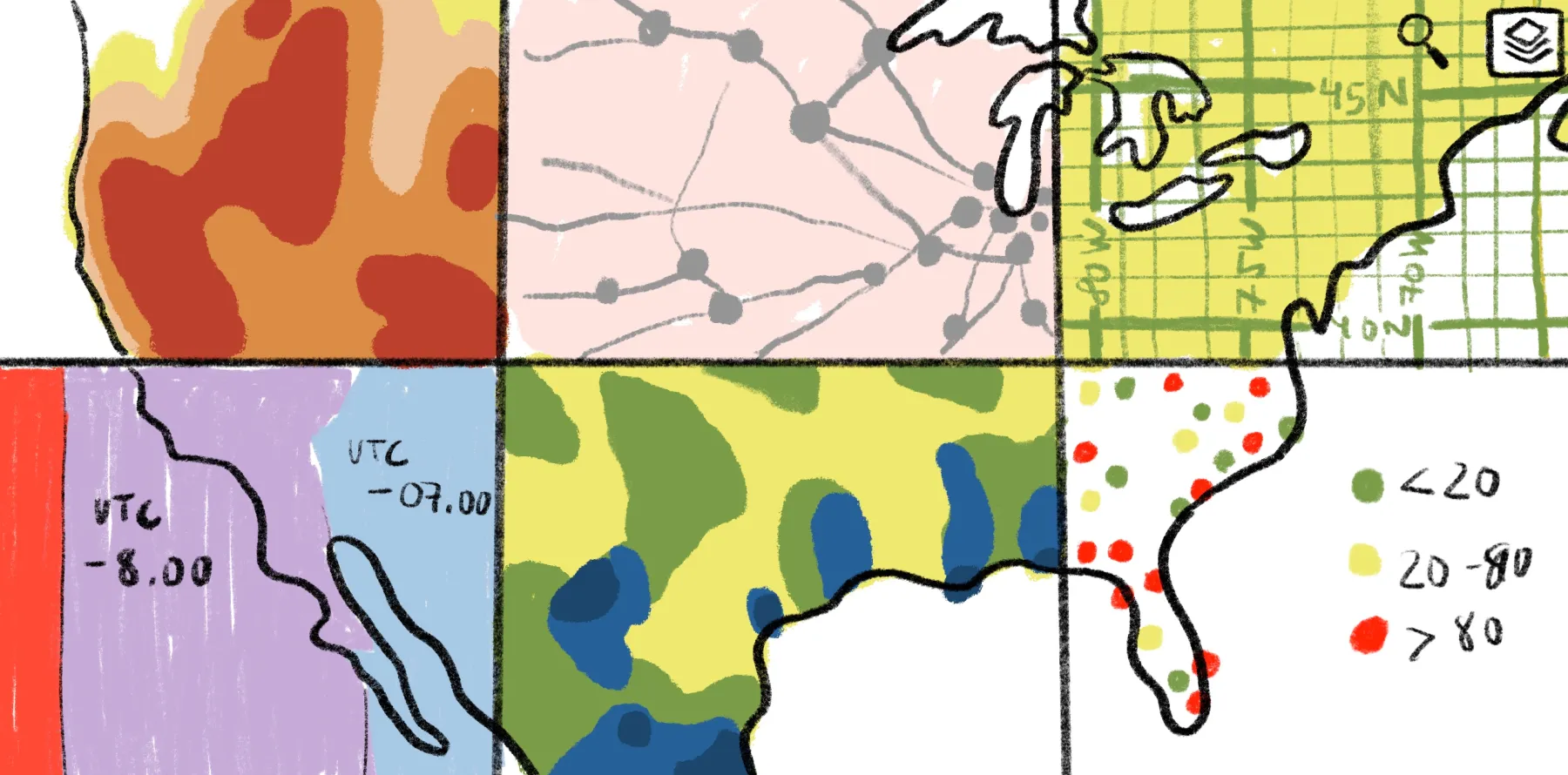
This data shows values that change across geographic space. Teams often use color ramps and surface layers to visualize gradual variation, like using temperature maps to help monitor climate-related risks.
People also visualize continuous data through contour lines. Say researchers use lines to understand elevation in relation to deforestation trends. They can then concentrate environmental efforts around key watersheds to improve future degradation.
Design and manage map symbology at enterprise scale with Felt
Consistent symbology gives enterprise teams a way to interpret geographic data — even when dealing with massive-scale workflows. When every map follows the same visual standards, organizations can make informed decisions faster, regardless of their team’s tech know-how.
Felt can help you achieve that understanding. Our cloud-native enterprise GIS platform lets you standardize map styling, visualize large datasets, and build interactive maps that scale with your business.
Maintain a single source of truth and unified styling across every team and project. Connect data from cloud sources like Snowflake, BigQuery, Databricks, Postgres, Redshift, Amazon S3, Azure Blob Storage, and Google Cloud Storage. Create maps with dynamic layers and consistent visuals, allowing stakeholders to align on priorities and make meaningful decisions in a collaborative space.
Explore Felt’s pricing plans to learn about cloud data connectivity, shared mapping workflows, and scalable spatial analysis. Then, browse the map gallery to see how organizations apply standardized symbology in real-world mapping projects.
Compare Felt using AI