
Map storytelling: How to turn spatial data into decisions
We have more spatial data than ever, but it isn’t always usable. Instead of driving action, insights are stuck in static reports or locked inside legacy software, causing a disconnect between the data and its potential impact.
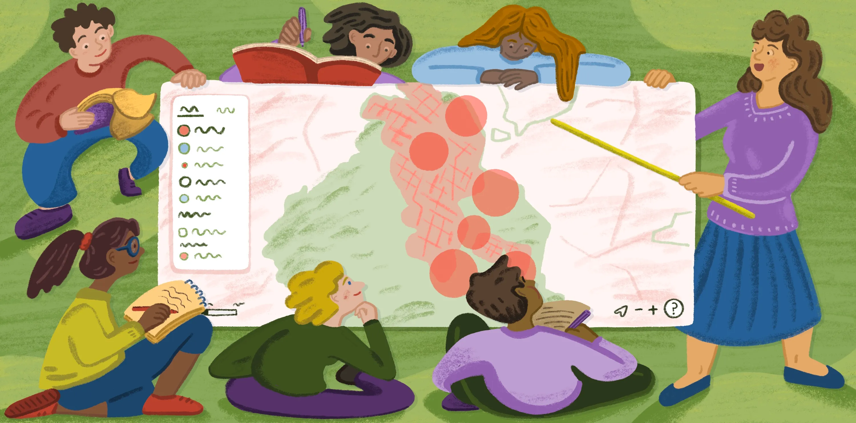
Map storytelling bridges that gap by turning massive data sets into compelling narratives that make complex information more relatable. It shifts focus from simply layering data to solving real-world problems through a shared experience. Whether tech-savvy or not, every teammate can understand and interact with these immersive maps, leading to informed group decisions.
In this guide, learn which types of story maps there are and how to build an experience that informs and inspires.
What are story maps?
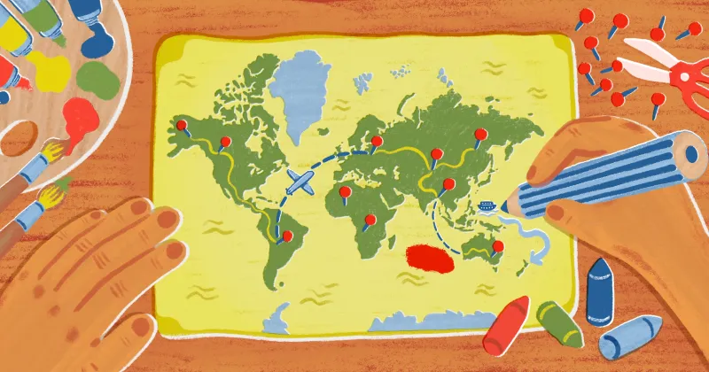
Story maps are interactive tools that pair spatial data with multimedia content, like text, video, and audio. They’re great for map experts and less tech-savvy people alike, helping people explore geographic information with engaging visuals and story blurbs.
These maps are often created in geographic information systems (GIS), allowing easy interaction and multiple data layers. They’re straightforward and simple to grasp for anyone working with spatial data sets — from shareholders and decision-makers to customers and members of the public.
Types of geospatial story maps
Here are four types of geospatial story maps for different use cases.
Guided tour
A guided tour moves through key locations in a set order, adding details and context at each stop to give you a complete picture. Guided tours are useful for linear storytelling, when you want to control how the story unfolds. You can layer in short descriptions or images to keep viewers engaged and make the narrative more memorable. For example, a story map might be a city’s historic buildings tour that shows prominent structures in chronological order, complete with descriptions of notable events.
Temporal map
A temporal map shows how a place or pattern changes over a defined period. It’s often used for tracking population growth and urban development, like using a choropleth map to visualize the rise and fall of housing prices across districts.
Because of the time component, you can see how past events connect to what’s happening now. Simple controls like sliders and animations let you explore those changes at your own pace so you’re not overwhelmed by information overload.
Swipe and compare
This thematic map format compares two views of the same place side by side — like satellite imagery before and after a wildfire or flood volume during two separate storms.
A simple swipe reveals these differences instantly, making it a powerful way to show change or contrast without much explanation. These maps work best when the visual difference tells the story on its own, with minimal supporting text.
Data-driven narrative
This type pairs maps with annotated charts, text, and images to tell a deeper, more connected story. Instead of focusing on a single moment or location, it brings together multiple data points to explain a broader idea. A public health organization might show how vaccination rates, infection clusters, and outreach programs combine to reduce disease spread. By breaking the story into smaller sections, you can introduce context and present findings more clearly.
Geospatial storytelling tools
Choosing a map format is just the start. You’ll also need to find the right story map software to turn your concept into a compelling experience.
There isn’t one superior platform for map storytelling. Choosing one depends on what the project is for and who will eventually use it. Some platforms are built for editorial polish or developer flexibility, whereas others prioritize collaboration. Here are the top options for creating interactive story maps.
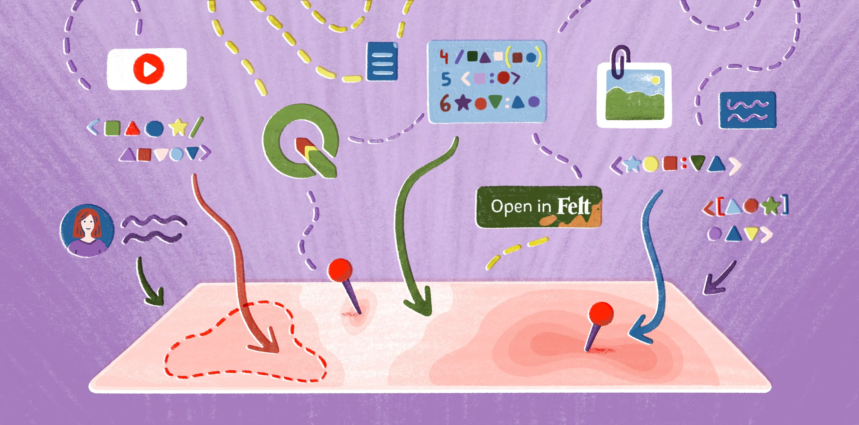
Felt
Felt is a cloud-native and AI-native web GIS built for teams that need more than a story map. Where dedicated storytelling tools give you a fixed narrative container, Felt keeps the full workflow in one place: upload data, run analysis, collaborate in real time, and publish a live, interactive map — all in the browser, with no software to install. The result is a shared working map that stakeholders can explore, comment on, and act from. Felt AI generates contextual popup descriptions directly from your data, and the same map that drives internal analysis can be shared publicly or embedded anywhere with a single link.
With Felt, teams can create deep, narrative-rich maps. Take the below story map as an example. Viewers can move through the Pacific Northwest and study seasonal patterns with the help of rich data layers and detailed text. It’s as simple as clicking through a slideshow step-by-step, where each slide reveals an intricate, colored map.
ArcGIS StoryMaps
ArcGIS StoryMaps is a no-code platform for designing interactive narratives with maps, text, and images. It comes with drag-and-drop story builders and swipe tours. This tool also builds 3D presentations using GIS maps and external multimedia. Teams use ArcGIS for applications like development projects, environmental reports, and climate change insights.
Mapbox Storytelling
Mapbox Storytelling is a low-code template. By combining text and images with animated 3D maps, it creates scroll-driven narratives where maps pan, zoom, and tilt to highlight geographic context. Businesses use Mapbox for applications like mapping wildfire spread and tracking annual wildlife migration.
Google Earth Studio
Google Earth Studio uses satellite imagery and 3D flyovers to turn geographic data into video content. Users can control camera paths and layers to create visual effects showing land changes and urban development in high resolution. It focuses on building linear narratives rather than freeform experiences.
How to create a story map: 3 steps
Here’s how to create story maps designed for your target audience.
1. Start with the purpose, not the data
Before you dive into layers and charts, think about your map’s intended outcome, like which decisions and insights your story supports. This lets you provide the right information and avoid overwhelming the viewer with too many details too soon.
2. Organize your layers into a narrative
Once you know the map’s goal, organize your data like a story by arranging locations in a logical order. Having a natural flow makes complex data sets more digestible and gives your map a cohesive narrative arc. For example, you’d sort details chronologically for a temporal map and geographically for a guided tour.
Highlight patterns using color coding and proportional symbols, and incorporate interactive elements like sliders and clickable layers. These features draw attention and help users directly engage with data.
3. Share, collect feedback, and iterate
Share your map with teammates, gather feedback, and make adjustments based on their input. Even small changes like rewording text or tweaking layer visibility can improve comprehension and ensure maps resonate with the audience.
Perfect your geospatial storytelling in Felt
Story maps let users see and touch data. Insights become clearer when people can interact with it, whether they watch information evolve over time or shift across a landscape. Bridging this knowledge gap empowers stronger decisions, giving stakeholders data in a form they can truly understand and put to use.
If you’re looking for a clean, simple way to generate story maps, give Felt a try. This web GIS makes it effortless to design an engaging experience and share it with a simple link. The intuitive interface lets people of all technical levels dig in, from decision makers to customers.
Felt can handle intensive processing. Render millions of features without performance issues, all while supporting multi-user collaboration and instant editing. Turn raw data into a shareable story map in seconds, right in the browser. And go even further with the Felt MCP Server: prompt an AI agent to pull data from your warehouse, build layers, and publish a shareable story map without leaving your AI chat interface.
Try Felt’s enterprise-ready platform, and turn your spatial data into compelling, actionable stories.
FAQ
How do you link a story map?
To share a story map, copy its URL and send it directly to your audience, whether through email or chat program. Most platforms also provide embedding links so you can add the map to your website.
How do I collect feedback on a story map?
You can collect feedback by sharing the map with collaborators and inviting comments within the platform. Some mapping tools let stakeholders leave notes on specific locations so feedback is tied to the data.
Can a story map update automatically when the data changes?
Story maps update automatically when they’re connected to live or synced data sources, like databases and APIs. This keeps maps current without manually rebuilding and republishing every time the data changes.
Compare Felt using AI


.jpg)
.webp)