How hotspot analysis detects meaningful spatial patterns
If data concentrates over a single spot on a map, it must be important — right? Not necessarily. Clusters can reflect high population density, data collection patterns, or the scale of the map itself. Hotspot analysis tests whether those crowded data points stand out in a measurable way, rather than just looking prominent on a map.
Read on to learn more about how hotspot analysis works and what its results can show. You’ll learn how statistical methods surface hotspots and cold spots, how to read patterns, and where hotspot analysis proves most useful. We’ll also explain how Felt helps teams visualize statistically significant data clusters on maps that empower strategic decision-making.
What is hotspot analysis?
Hotspot analysis is a spatial analysis technique that evaluates where data clusters across a geographic area. These clusters of spatial data represent high volumes of specific incidents, observations, or measurements tied to a particular location. Hotspot analysis helps determine if clusters represent meaningful spatial patterns or random variation.
What’s a hotspot?
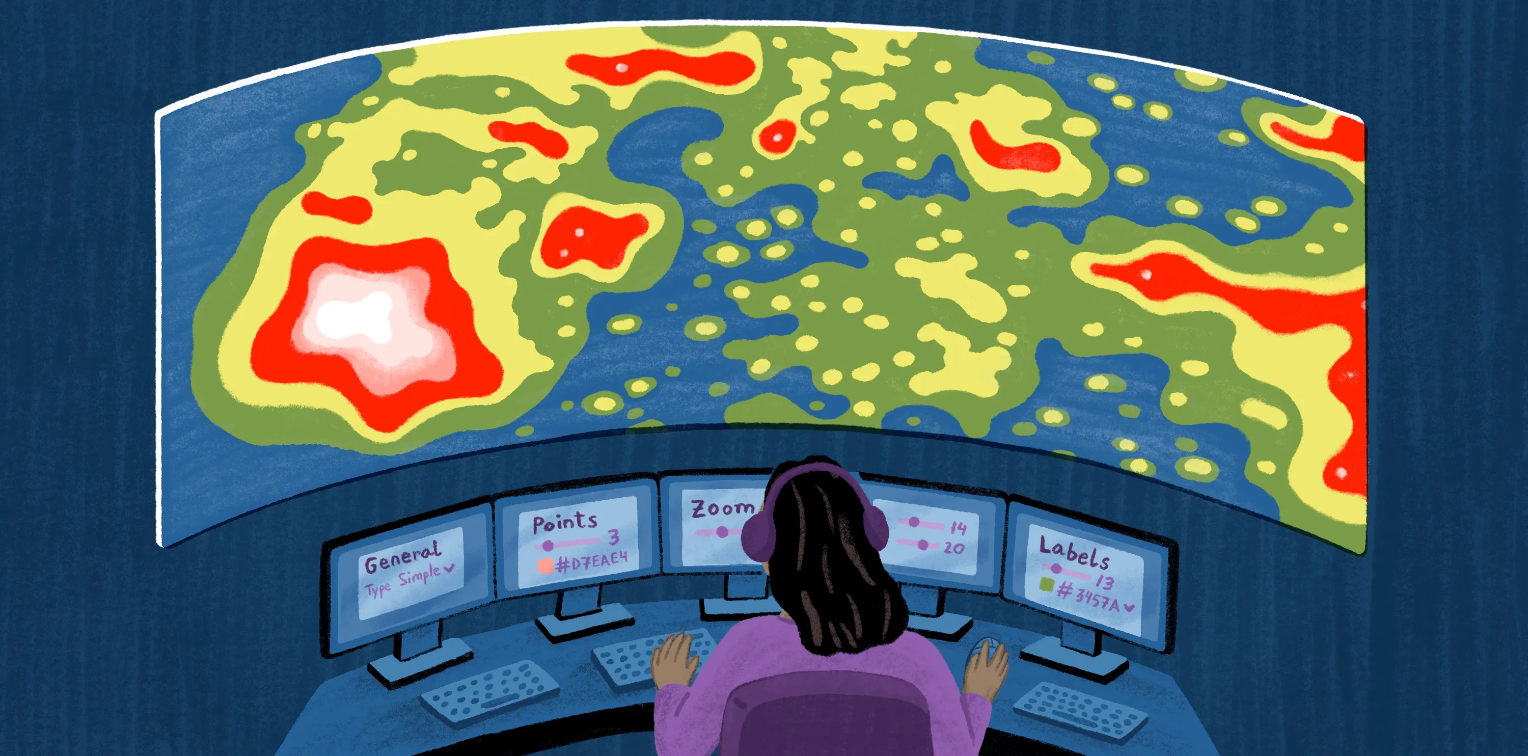
First, let’s start with a definition of hotspots — areas where events occur in a way that is statistically significant, suggesting a pattern unlikely to be due to chance. This pattern reflects spatial autocorrelation, where nearby events tend to show similar behavior. When nearby areas show similarly high activity, the data shows a positive spatial autocorrelation. A cold spot reflects the opposite pattern, where events occur significantly less frequently than expected and show low activity clustering together.
For example, a hotspot map might show an area with consistently high crime reports compared to its nearest neighbors. A cold spot highlights a study area with unusually low activity relative to surrounding areas.
Hotspot analysis evaluates whether these clusters reflect a genuine spatial pattern or could plausibly occur at random. Rather than relying on map visualizations alone, hotspot analysis assesses how features relate to their nearest neighbors across a study area.
Why spatial data clustering and proximity matter
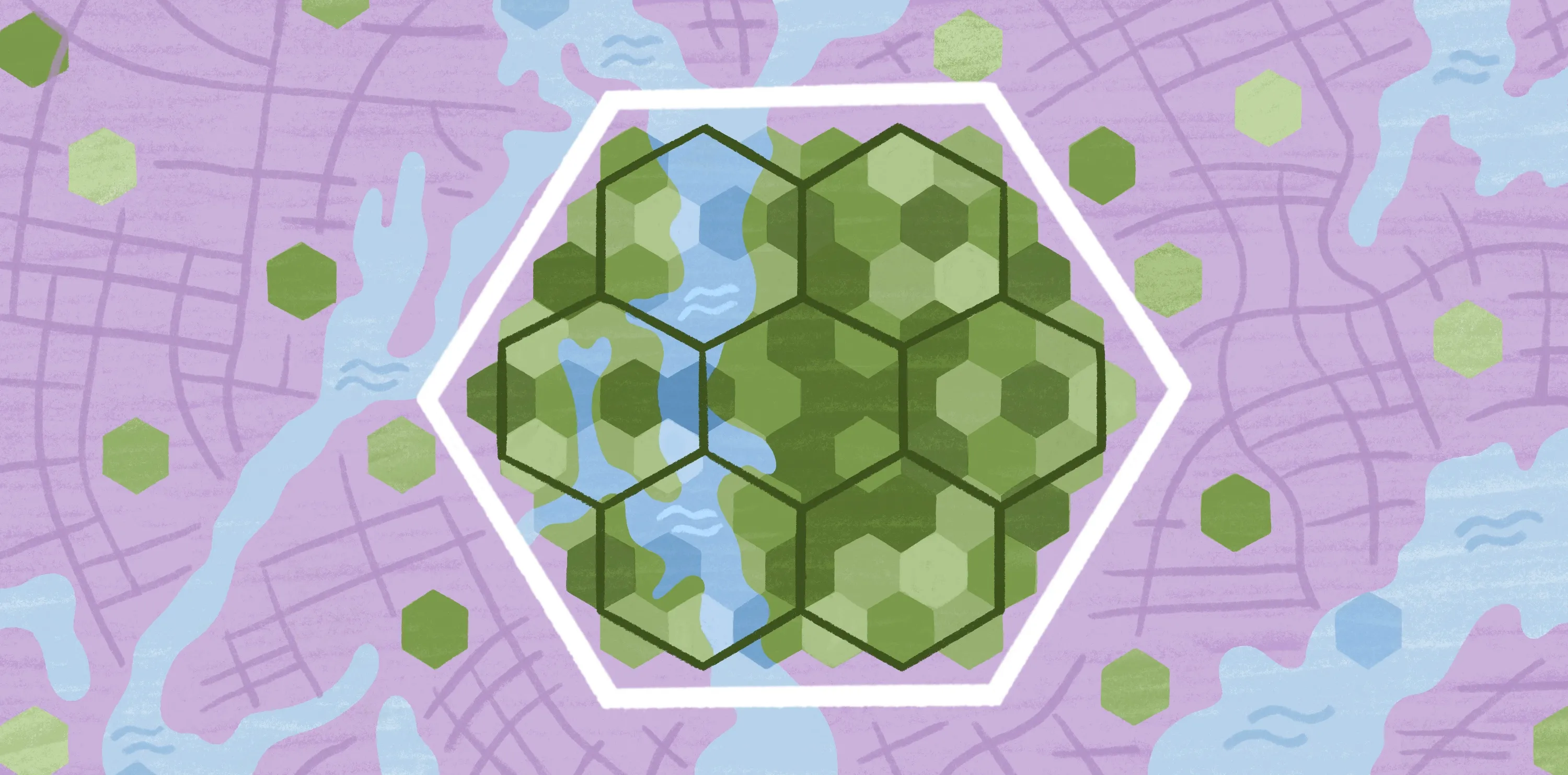
Hotspot and cold spot analysis focus on clustering rather than individual data points. A single event at one location rarely reveals much. However, several similar events appearing near one another can indicate a meaningful pattern.
Events that occur close together tend to share context. They may be shaped by population density, access constraints, or other geographical factors. Cluster analysis looks for these spatial relationships by evaluating how events are distributed spatially, rather than treating each location as independent.
How hotspot analysis evaluates clusters
To evaluate clustering consistently across a study area, the Getis-Ord Gi* statistic is commonly used for hotspot detection. This method provides a standardized way to identify hotspots and cold spots by measuring how strongly features cluster relative to the rest of the map. Instead of relying on visual interpretation, it helps distinguish meaningful clusters from patterns that only look dense on a map.
Where hotspot analysis delivers the most insight
Hotspot analysis works best with spatial data that represents repeated activity or consistent measurements across a fixed geographic area. Below are the types of data that best support reliable hotspot analysis:
- Incident data: Individual events recorded at specific locations
- Density surfaces: Spatial layers that show how concentrated activity is across a study area
- Sensor outputs: Repeated measurements collected at fixed locations
- Counts or rates: Numeric values that describe activity within defined parameters
With the basic concepts behind clustering and hotspot analysis in place, the mechanics become easier to calculate.
Steps to calculate hotspot analysis
The mechanics of hotspot analysis are fairly simple, but the setup determines whether the results show statistical significance or random clusters. Here’s how to set up and calculate a hotspot analysis with confidence.
1. Prepare and structure your spatial data
Start with your spatial data, which should include standardized numeric values and locations. Ensure your data is complete and mapped within a clearly defined study area. Each record should represent a specific spatial phenomenon you want to analyze, such as disease rates or traffic incidents.
2. Run the hotspot calculation
Hotspot analysis uses a statistical method like the Getis-Ord Gi* statistic to evaluate clustering on a map. Prior to running a calculation, you’ll need to define proximity. This can be a fixed distance or neighboring study areas. These choices determine how the hotspot analysis groups features.
3. Interpret hotspot results correctly
The resulting map shows where clustering stands out, not why it happens. Hotspots indicate areas with unusually high activity relative to nearby locations. Interpreting these results requires your team to determine context about data sources, spatial boundaries, and external factors that might influence clustering.
When hotspot analysis is the right choice
Density or heat maps are types of maps that show where points pile up, but they don’t necessarily reveal context or statistical significance. Teams use hotspot analysis when clustering needs to be acted on, not just displayed.
Here are the common use cases:
- Public health: Teams identify areas with unusually high case counts or sickness rates. It can help surface emerging disease outbreaks, gaps in testing, or when specific seasonal illnesses hit their peak.
- Conservation: Groups evaluate repeated incidents across space, such as habitat loss or illegal poaching. Understanding how these measurements cluster over time and space helps teams focus monitoring, enforcement, and restoration efforts in areas that experience consistent environmental pressures.
- Transportation: Planners examine car accidents, incident frequency, or congestion measurements tied to specific routes or intersections. Hotspot analysis helps distinguish between one-off accidents and areas with significant safety issues, supporting planners to make better decisions around enforcement or infrastructure.
- Urban analytics: Teams analyze patterns in service requests, inspections, or response times across an urban landscape. Evaluating where these patterns cluster helps city planners understand where infrastructure may be under strain.
While hotspot analysis can be a powerful tool for guiding resource allocation, it isn’t always the right method. It works best with dense data collected evenly enough to support reliable clustering. Datasets that are sparse or highly skewed toward a few locations will overemphasize clusters and lead teams astray.
See how teams use Felt to map hotspots with AI-assisted tools
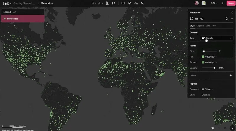
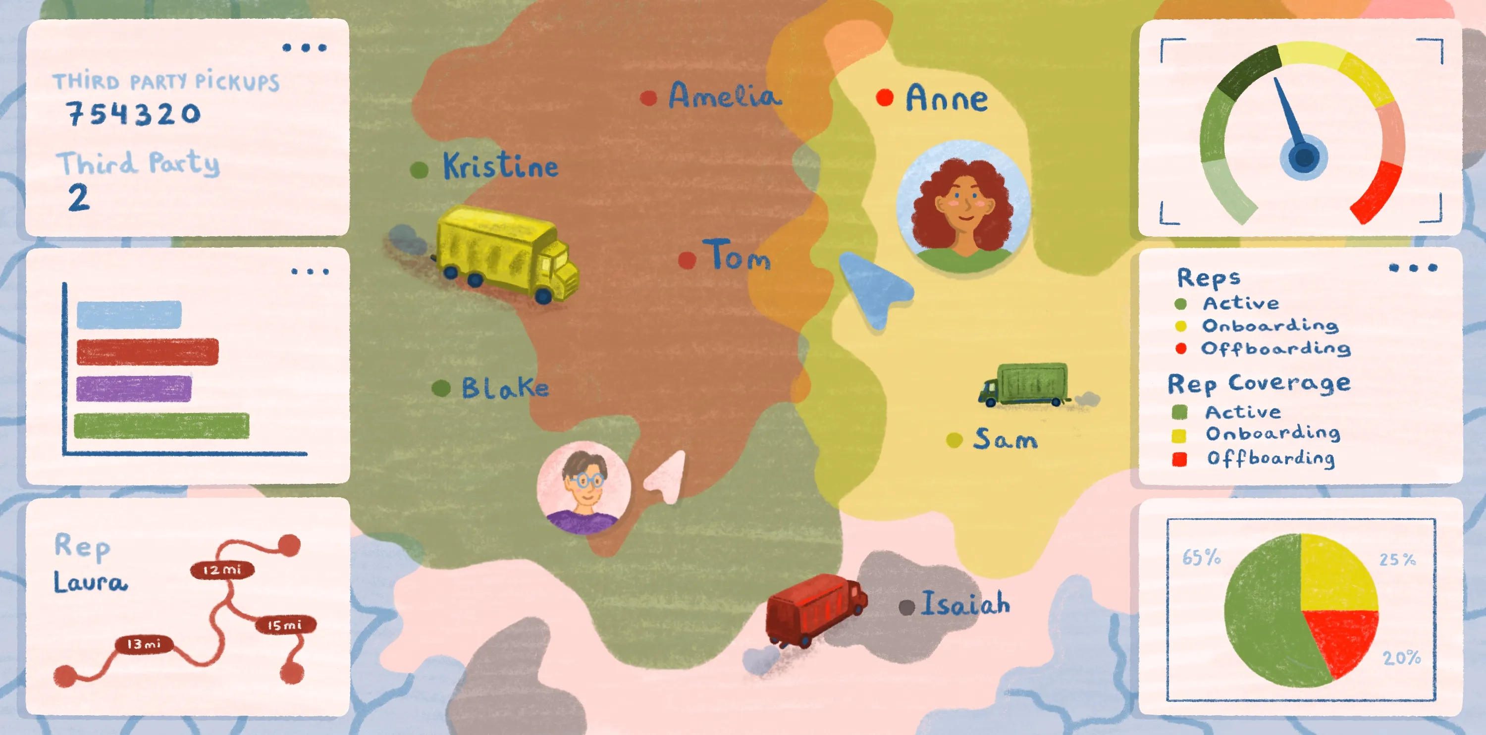
Felt makes it easier for teams to run hotspot analysis without complex GIS workflows. Teams can upload their spatial data, visualize clustering across a study area, and explore hotspot results directly in the browser. AI-assisted tools help surface patterns quickly, while cloud-native maps make it easy to share outputs in real time.
Because everything lives in one shared workspace, hotspot maps remain available to all teams instead of becoming isolated or inaccessible. Non-GIS teams can view results, ask questions, and make decisions together.
Explore how teams use Felt to analyze hotspots collaboratively and accelerate spatial decision-making. Book a demo today.
FAQ
What method calculates the density of events in a given area?
The Kernel Density Estimation (KDE) is a standard approach to visualize how density changes spatially. It helps assess how events influence nearby locations.
What’s Kernel Density Estimation (KDE)?
The KDE uses a weighted calculation to assess event density. It gives more weight to events that occur at closer locations. The result is a smooth surface map — like a heat map — that visually highlights areas of higher and lower activity.
Can hotspot analysis work with small datasets?
Small datasets tend to produce unstable or misleading results. Without robust spatial data, it’s hard to assess whether clusters reflect real spatial patterns or chance groupings.
Compare Felt using AI


.webp)