Temperature, wind, precipitation, and other datasets bring rich context to maps. Visualizing global distributions of these data is not only useful for understanding conditions in a given location, but also reveals patterns in earth surface phenomena across the landscape. From patterns of winds across oceans to moisture-laden atmospheric rivers funneling water away from the tropics, effective weather visualizations create better understanding of our planet.
The National Oceanographic and Atmospheric Administration (NOAA) publishes a wealth of observed and modeled data about these dynamic earth surface processes. However, getting this data out of the the NOAA website and into a striking cartographic visualization can be challenging. In this post, I’ll show how to unlock the power of these data using the Felt API.
Requirements
We’ll be using a number of python libraries commonly used in raster data processing and visualization, and will be working in a jupyter notebook environment. To get these libraries, use a virtual environment and install with <p-inline>pip<p-inline>:
Then, import these libraries in your notebook:
Getting data from NOAA NOMADS
The NOAA NOMADS (NOAA Operational Model Archive and Distribution System — have to love the backronym here) website contains links to a wealth of observed and modeled atmospheric, oceanic, and even space conditions. While we won’t walk through all of the datasets, two of the most commonly used models are:
- GFS, the Global Forecast System. This model contains global data with a large array of weather and oceanic variables. It outputs data at an approximately 13km resolution, with hourly forecasts for 120 hours from model run, and 3-hour forecasts for predictions beyond that, all the way up to 16 days past the model time.
- HRRR, High Resolution Rapid Refresh. The HRRR model is a high resolution (3km) model over just the Continental United States, and outputs a large number of weather variables in 15-minute model and prediction increments (the “Rapid Refresh”).
These datasets are also available via the AWS Registry of Open Data (https://registry.opendata.aws/noaa-hrrr-pds/ and https://registry.opendata.aws/noaa-gfs-bdp-pds/).
For this post, we’ll be exploring global wind gusts predicted by the GFS model. However, the same techniques can be applied to nearly any data linked above, so feel free to adapt to your own use case.
Requesting data
One of the quirks of accessing data through the NOMADS portal is its ephemerality — because of the pure volume of data, access to data from a single point in time is only available through a relatively short window. For this post, you may be reading on a day where the data I use is no longer accessible. In order to manage this, we should understand which parts of our request URL should be variabilized and changed. Here is our complete url:
Breaking this down, we have:
- <p-inline>https://nomads.ncep.noaa.gov/cgi-bin/filter_gfs_0p25.pl<p-inline> our base url
- <p-inline>dir=%2Fgfs.**20230711**%2F**06**%2Fatmos<p-inline> which contains todays’s date <p-inline>20230711<p-inline> and model hour <p-inline>06<p-inline>
- <p-inline>file=gfs.t06z.pgrb2.0p25.anl<p-inline> which has has our model hour (<p-inline>t06z<p-inline>) and forecast hour (<p-inline>anl<p-inline> which is the “instantaneous” forecast of hour 0).
- <p-inline>var_GUST=on<p-inline> which denotes what variable to request
- <p-inline>all_lev=on<p-inline> which denotes which atmospheric levels to request (in our case, wind gusts are only one level)
- <p-inline>subregion=&toplat=90&leftlon=-180&rightlon=180&bottomlat=-90<p-inline> which sets the extent to global
You can construct these urls using the NOAA NOMADS portal. The functionality and url formats vary by model, so you’ll have to explore a little deeper depending on your use case. For GFS and HRRR data, click the “gribfilter” link next to each model, then construct a url by selecting the model run, parameters, levels, and subregion and clicking “show url”:
.webp)
We’ll open this url using urllib and a rasterio MemoryFile, which will save us a step of downloading manually:
This reads the entirety of band 1 as a single numpy ndarray, <p-inline>gusts<p-inline>. This ndarray contains pixel values that represent wind gusts in meters/second.
Keep in mind that some parameters in the GFS, HRRR, and other models may exist at multiple atmospheric levels, so your raster will have data in multiple bands. We can read each band’s tags to learn more about the included data — units, valid forecast time, etc — with a rasterio sources <p-inline>tags<p-inline> method:
To visually look at this data, let’s display with <p-inline>imshow<p-inline>:
.webp)
We can already see global patterns, and the signals of landmasses, oceans, and terrain are present in the depicted data!
To create the above image, matplotlib is converting our wind gust pixel values into colors under the hood. However, we’ll want to perform this conversion ourselves to control the appearance, and convert to a format understood by Felt’s Upload Anything API.
Converting for visual display
Recall that each pixel in this dataset represents a wind gust speed in km/hour. However, we need to convert these to colors for visual display. This process is typically called “color mapping” where we map each pixel value over to its relative position in a color gradient.
Let’s look at the distribution of pixel values in <p-inline>gusts<p-inline> with a histogram. this will give us a feeling for how we should apply a color ramp to the data:
.webp)
We can see that the data ranges from wind gusts of 0 m/s to nearly 40 m/s, with a distribution skewed to the right. The default method for color ramps applies them across the full range of data, which in our case will mean that most of our data will exist within a small part of the dynamic range (between 0 and 20). If we set the maximum value to 30, our colors will be better distributed across the image, giving us more detail across the map:
.webp)
To do this, let’s “clip” out any values higher than 35 (m/s) and set them to 35. Then, we’ll normalize the data to a range of 0-1 with some simple math:
To colorize this range of values, we can use <p-inline>matplotlib.cm<p-inline> which comes with a number of default color ramps. Viridis is always a good choice, as it is perceptually uniform and works well with most types of colorblindness. Moreover, the colors in viridis “feel” good for wind speed, which allow us to make a readable yet striking map. To do this, we’ll create a map from our normalized data, then scale it back out to a 0-255 unsigned 8-bit range for writing in RGB:
Recall that we initially read the data into a single array; let’s also read the dataset’s metadata which georeferences the data:
We can then update the metadata with what we’ll want to write:
Uploading to Felt
First, create a new Felt map, and copy your map id. Then, create an access token for upload to felt (see the “Authorization” section here).
We’ll use rasterio’s <p-inline>MemoryFile<p-inline> capabilities again to avoid having data on disk altogether. Our tiff is written to memory, and this file object is uploaded to Felt:
If this succeeds, you should see a “Processing” message in your layers panel:
.webp)
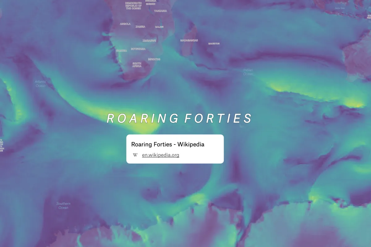
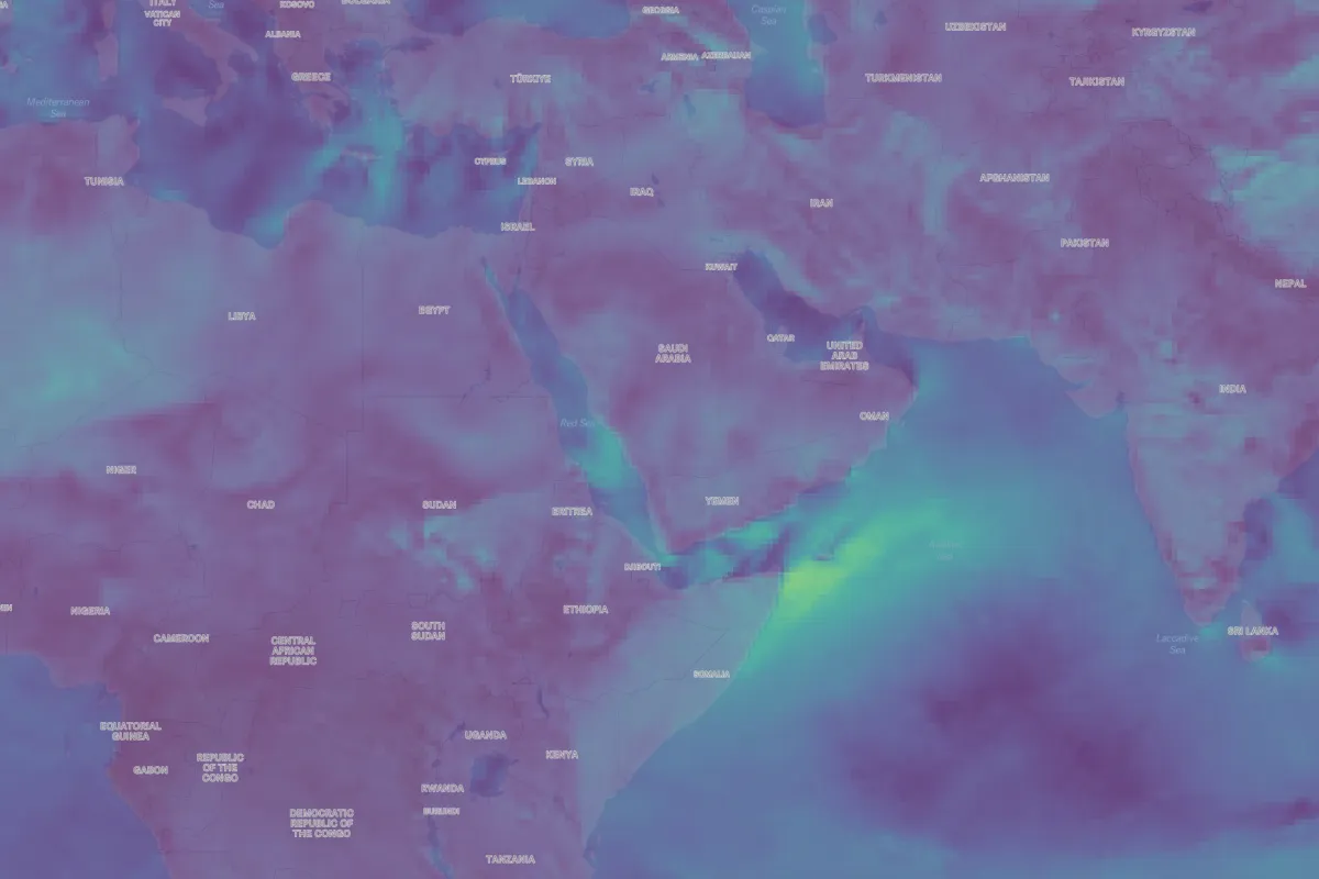
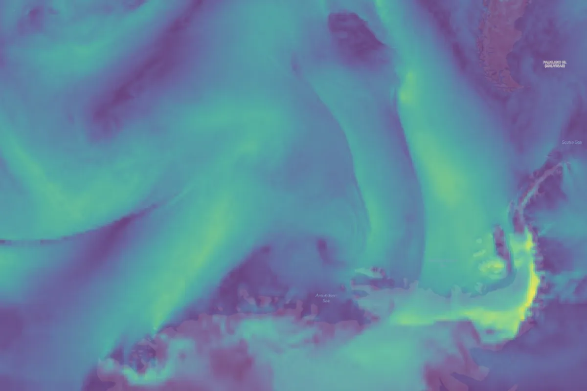
When this is complete, you will have wind gusts displayed on a map!
You can see the Roaring Forties, strong westerly winds that occur in the Southern Hemisphere:
Strong winds off the Horn of Africa:
Swirling eddies off the Antarctic Peninsula:
Annotating patterns in the data
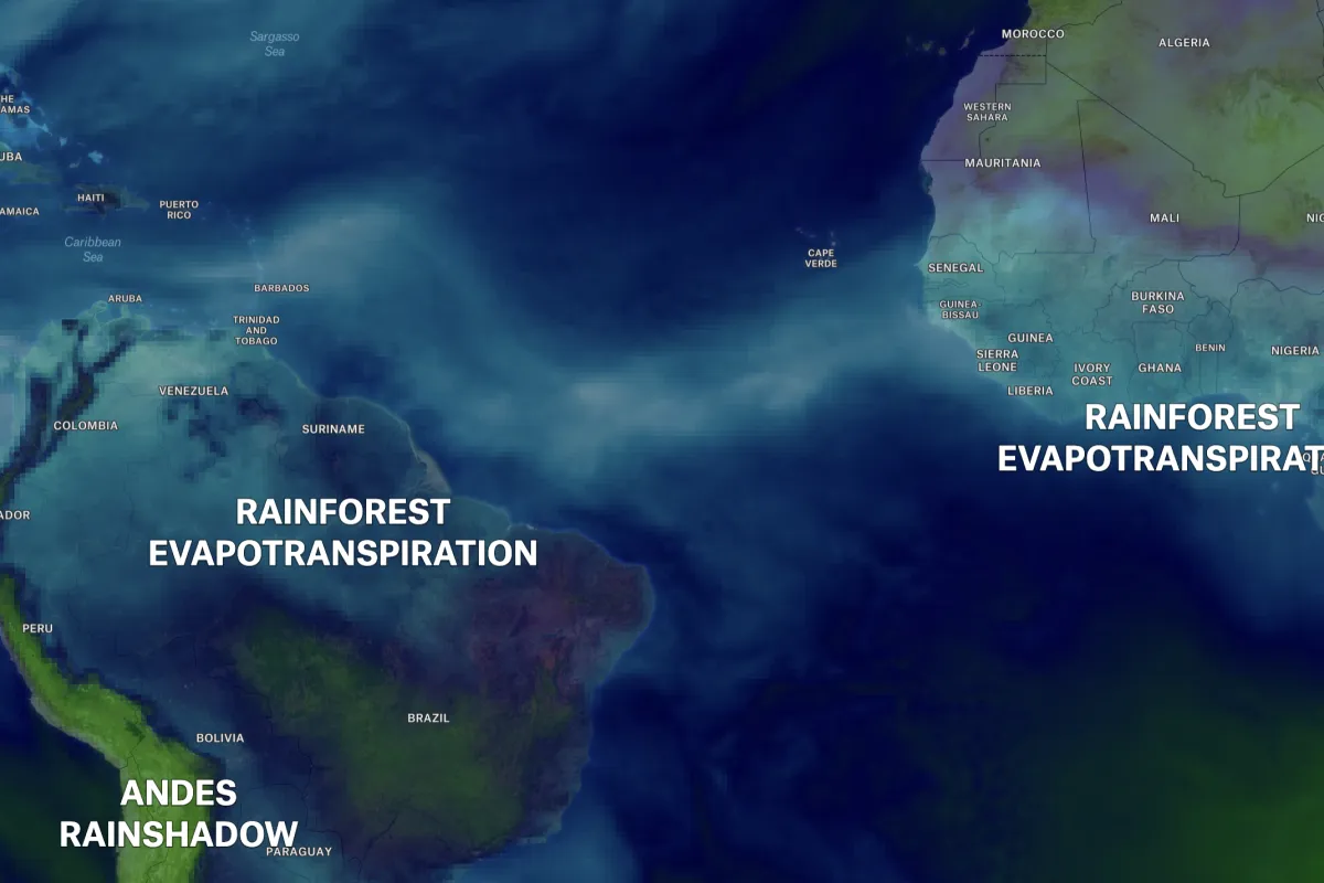
We can perform a similar process with another GFS variable, Precipitable Water, which is one of the more esoteric yet beautiful weather datasets. Felt’s annotation capabilities make labeling patterns in the data simple, which allowed me to label some atmospheric features shown in this dataset; for instance, the high density of water over the intertropical convergence zone:
.webp)
Here, we can see evapotranspiration from the Amazon and Congo Basin Rainforests:
Here’s the live map to explore.
These are just a few examples of incorporating weather data into a Felt map. How might a weather visualization help your use case? What context would wind, temperature, or snow depth bring to your Felt Maps?
Earlier, I described how getting data off of NOAA servers and into a visualization is a challenge; what I demonstrated here is still highly technical, and requires a good amount of intermediate processing. At Felt we want to change that (Upload Anything!), so look for more features supporting this kind of data later this year.
Share your map with the world!
Exploring our API and want to share your findings? Looking for feedback to improve your Felt map? Join our subreddit and meet other passionate mapmakers and developers!
Compare Felt using AI


.jpg)