37° 48' 15.7068'' N, 122° 16' 15.9996'' W
MODERN MAP MAKING HAS ARRIVED
37° 48' 15.7068'' N, 122° 16' 15.9996'' W
MODERN MAP MAKING HAS ARRIVED
37° 48' 15.7068'' N, 122° 16' 15.9996'' W
MODERN MAP MAKING HAS ARRIVED
37° 48' 15.7068'' N, 122° 16' 15.9996'' W
MODERN MAP MAKING HAS ARRIVED
37° 48' 15.7068'' N, 122° 16' 15.9996'' W
MODERN MAP MAKING HAS ARRIVED
37° 48' 15.7068'' N, 122° 16' 15.9996'' W
MODERN MAP MAKING HAS ARRIVED
37° 48' 15.7068'' N, 122° 16' 15.9996'' W
MODERN MAP MAKING HAS ARRIVED
37° 48' 15.7068'' N, 122° 16' 15.9996'' W
MODERN MAP MAKING HAS ARRIVED
37° 48' 15.7068'' N, 122° 16' 15.9996'' W
MODERN MAP MAKING HAS ARRIVED
37° 48' 15.7068'' N, 122° 16' 15.9996'' W
MODERN MAP MAKING HAS ARRIVED
Maps
Editorial
Learning from history: why we should study old maps
Associate Director at GreenInfo Network Vanessa Knoppke-Wetzel on historical maps, Halloween, and mapping for good.

Your career spans over a decade, and you've been creating digital and physical maps as well as working for government organizations and tech companies. How did you first get into cartography?

I didn't know about cartography until I was required to take a cartography course in my Geography major. And I only knew geography was an option and a field to study because I took an environmental conservation class that I loved! Honestly, the beginning of my career felt like falling into something out of random discovery.

I triple majored in undergrad and took all the possible classes to create my own "personal major" that, in my mind, was environmental studies at the University of Wisconsin, Madison (at the time, it didn't have that as a major). I'm half Chilean, and a lot of my undergrad, I connected many of my geographic and mapping projects with my Spanish linguistics major and Chile. 

Initially, I intended to get a Master's in Geography. I wanted to do research the field and study the effects of dams that were going to be built in Patagonia (Chile). I ended up being offered a spot in the Cartography & GIS program at the University of Wisconsin-Madison. I really loved a class on geovisualization and interactive maps, so I said yes right away.  

At the time, I didn't know that the University of Wisconsin-Madison is one of the top schools for cartography. However, when I began attending the North American Cartographic Information Society (NACIS) conference, I realized how many people didn't have similar opportunities because many schools across the country do not offer as many spatial courses. That's why I care a lot about teaching and accessible education, and of course, community advocacy — that is a big part of my work. 

Your thesis is focused on historical map styles. Why did you choose this subject? Is it helpful when you're creating maps at work?

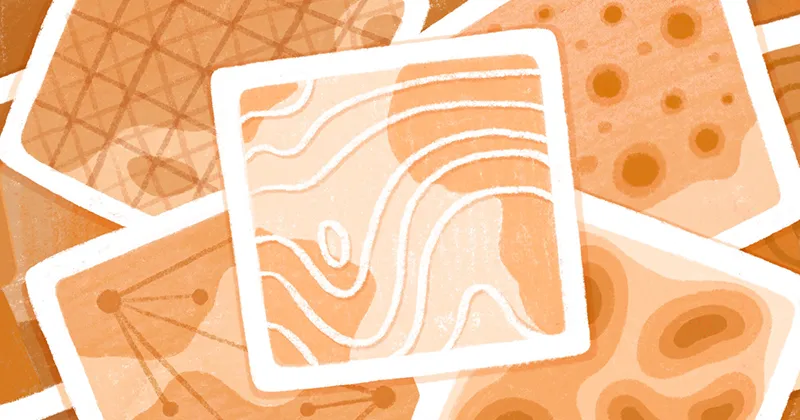
I had always wondered why we were never taught how to recreate any kind of maps. In grad school, I realized that these classes don't exist. My mom is an artist, and she has been experimenting with different mediums and styles since I was a kid. I wanted to attempt to do something similar with my thesis and define styles in the history of cartography. On a selfish level, I wanted to understand how to recreate any map! I settled on pre-1900s and then only on woodblock, copper plate, and lithograph styles. 

That thesis directly affected every single job I've had since then. For my first job, I worked at The Office of U.S. Foreign Disaster Assistance (now the Bureau for Humanitarian Assistance) at USAID. I made maps about international disasters — which I enjoyed because making these maps directly helped people in other countries. In addition to spatial analysis work, I redesigned some of their maps. All the work I did for my thesis allowed me to break down every style, analyze them, and then understand how to recreate them.

For my next job at The National Fish and Wildlife Foundation (NFWF), I established a brand as their first cartographer and graphic designer. When I joined Mapbox as a Senior Map Designer, my cartography background also helped me navigate zoom-level styling: as cartographers, we often only learn how to work at one zoom level. So I think my thesis and understanding of how to break things down and helped me a lot when creating web maps and making them look good at various zoom levels. 

In addition to more practical aspects of my degree, it's been super important for me to understand people's different histories and cultures through mapping. The way cartography is taught in the U.S., and I imagine Europe, is a very Eurocentric view of history. In other countries, people mapped the world differently. My favorite example of that difference is Asian scroll maps. I've seen one at The Freer Gallery, and it takes up an entire wall. Looking at this map is a bodily experience as you're moving rather than putting it flat on a table. It feels like walking alongside the road or the river. Art history matters a lot for culture, and it matters just as much to look at global styles of maps to understand history. Different places and people have different perspectives, and it is important to know them and also understand how to incorporate knowledge we don't immediately think about.

What are your favorite map styles that you created?

My Burtonesque style (also book cover art!) is a favorite for several reasons. First, Halloween is my favorite holiday, and this style was created as a Halloween map. I didn't want to do a stereotypical Halloween style and just use orange, purple, black, green colors. That is great, but I wanted to do something more creative. I immediately thought about Tim Burton's aesthetic and how it would be a perfect Halloween style for a map. People immediately recognize his aesthetic due to the unique visuals he incorporates into all his work, so I also knew it would be easy to figure out what could be pulled into a map.

You recently joined GreenInfo Network as an Associate Director. This organization is focused on "mapping in the public interest." What does it mean to you?

I feel really grateful to have this job because I get to work with people who care about building a safe space that really cultivates growth. We also work on many notable projects for nonprofit organizations and state and federal orgs. 

One recent GreenInfo Network project I'm proud of is the woodblock style I created for OpenHistoricalMap (OHM). This organization is similar to OpenStreetMap in that it's focused on community-led data collection, but it's all historical data. OpenHistoricalMap is important because historical data is scattered across so many places worldwide, but only in print. People are adding data from historical maps covering different regions and different eras, which makes it accessible to everyone online. For the woodblock style, OHM wanted to provide some historical styles in addition to the standard OSM styles, and I was excited to create it, as I used my entire career's knowledge to build this map (Master's thesis to present).

Art history matters a lot for culture, and it matters just as much to look at global styles of maps to understand history.

You started #CreativeCarto, a community focused on creativity and learning in cartography. What practices are most helpful for people who are into mapping but want to be more creative?

Attending conferences is always immediately applicable because even if you can't learn everything from every talk, you can write down the things you want to explore. And in some cases, it is immediately digestible in something you can pull into your work. For example, when I started, attending conferences immediately helped me see what I cared about and find the right direction to grow. 

I also think that when you're just starting out, you have to remember that you do not need to know everything. It is okay to be aware of what else exists. At the beginning of my career, I felt like I needed to know everything, and it was hard to feel creative because I saw my lack of knowledge of some things as a roadblock. In the spatial world, people come from so many different backgrounds, and it's okay to ask for help. If you can't go to conferences, you can still be part of the community in various ways. For example, on Twitter, there is a hashtag called #GISchat. It has existed for years where you can ask a question via the hashtag, and someone always will answer. #GISchat meets weekly, so it also is a great space to get to know people in the spatial community.

What is your best advice for creating impactful maps for beginners?

If you're starting out, drawing a map by hand might even make more sense for you than dealing with many data layers, making sure those sources are correct, getting into professional software, etc. If you know you need to make a map and you understand the community you're in, drawing something is still really useful. It's about knowing your audience — if you put something your audience recognizes on the map, it can be effective. 

Drawing is also helpful because it is often how I sketch and wireframe ideas for projects. Everyone sketches differently — some people do all their sketching on screen (in Adobe Illustrator, Figma, etc.). Regardless of where you start, it can be worth sketching out an idea to decide what you may need or not. With spatial anything, it also is always useful to know what the data looks like. I am a visual person, so I need to know more than just the data attributes that the spatial data has. I need to know what it looks like — where is the data concentrated, how sparse does it look on a map, is it only in a specific region, or is it nationwide? Part of my "sketching" time sometimes includes getting the data added into spatial software and getting some of the visual work done. Visual questions have to be answered to decide what to do with the data as well. At that point, I usually try to add all the other relevant data because, cartographically, I will need to consider visual hierarchy design choices to ensure the map is legible.


Vanessa's Halloween-themed map in Felt. She wanted to avoid cemeteries in an apocalypse, and then also naturally avoid most populated areas because dense areas will get the most Zombie attacks.

In Felt, all of the above likely means choosing a basemap that seems appropriate for the type of data you are using and what "story" you want to tell with the data. Is it a reference map? Does the map require road infrastructure to get the point across, is the data about nature-anything — maybe the latter means choosing an outdoorsy-focused basemap. Then, I would add the data to my chosen basemap and do all of the above steps. 

What is great about the spatial industry is that everything we do is tool agnostic — we have to figure out how to do what we want to do in the capacity that the tools give us. It's also why being a cartographer is so cool — you have the world at your fingertips, and also get to learn and grow constantly.

P.S. We really love Halloween, so we are hosting our first-ever Halloween mapping challenge! Create a fun, spooky, or scary map and get a chance to win a limited edition Felt bucket hat & sticker set. Here's how to participate:

  • Share your map in the #showoff-your-map channel by October 24;
  • On October 28, we'll announce 5 winners across the 5 categories outlined in Slack!
When you're just starting out, you have to remember that you do not need to know everything.
Bio
Vanessa Knoppke-Wetzel (she/her) has worked in the federal government, non-profits, tech industry, and higher education. She currently is a Director at Large for the North American Cartographic Information Society (NACIS), where she chairs the Diversity, Equity, and Inclusion Committee; an Alumni Mentor for UW-Madison's SuccessWorks; and is the 2022 DC Meet Director for Pull for Pride. She also is the founder of #creativeCarto, and one half of the 2021 URhere podcast.
LinkedIn
More articles

Cartography Tips for Designing Web Maps

Search, filter, select — data discovery done right

Getting the most out of Felt’s new Workspaces

Teaching Spatial Analysis with Felt

Powerful new admin tools and a streamlined billing experience

Three key UI upgrades in Felt 2.0